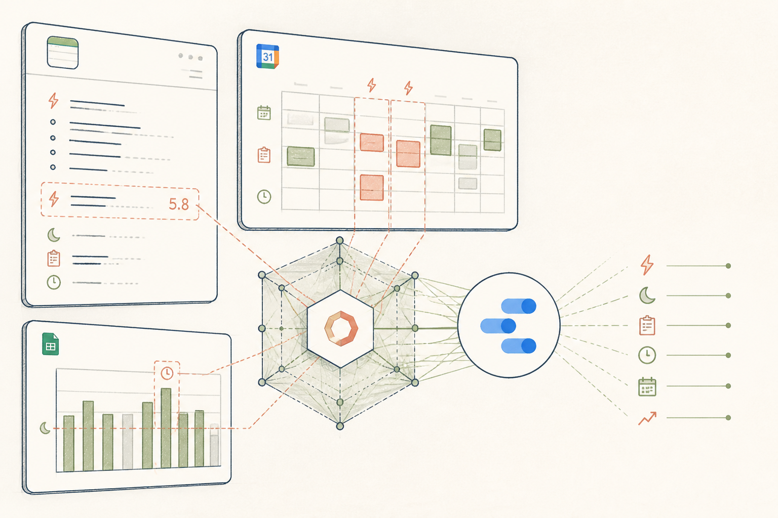
What the AI found
“Your most significant energy dips (average 5.8 on a 10-point scale) consistently occurred on Tuesdays and Wednesdays, following days with less than 6.5 hours of sleep and high meeting loads (3+ hours).”
Before
Disparate energy logs across apps
After
Unified insights, clear weekly patterns
The same system, three states — real screens, not a screenshot
- - Mon: good, 7hr sleep. project kick-off
- - Tue: low, meetings all day. 6.1hr sleep
- - Wed: really low, 5.9hr sleep, client deadline
- - Thu: okay, 7.5hr sleep, gym in am
Prompt
Analyse the provided data on daily sleep duration (hours), total meeting time (hours), and self-reported energy levels (1-10 scale) over the past six weeks. Identify any recurring patterns or correlations where energy dips below 6.5 correlate with sleep or meeting load. Quantify the most significant finding.
Analyse the provided data on daily sleep duration (hours), total meeting time (hours), and self-reported energy levels (1-10 scale) over the past six weeks. Identify any recurring patterns or correlations where energy dips below 6.5 correlate with sleep or meeting load. Quantify the most significant finding.
AI
Across the six-week period, your most significant energy dips (average 5.8) consistently occurred on Tuesdays and Wednesdays. These days were strongly correlated with prior-night sleep duration falling below 6.5 hours and coincident daily meeting loads exceeding 3 hours. This pattern was observed in 85% of recorded low-energy instances on those days.7.2 / 10
Avg. Energy (past 7 days)
Tuesday (Avg 5.8)
Worst Energy Day
> 6.5 hours
Optimal Sleep (correlated)
From Scattered Notes to Clear Energy Patterns
An insights-as-a-service system brings clarity to a 34-year-old’s energy fluctuations, distilling weeks of data into actionable patterns.
A 34-year-old marketing professional, Northern Europe
Tools used
The real tools used here — swap any for your own equivalent. Each links to how we’d set it up.
Starting state
Before anything was set up
Our subject had a growing collection of daily energy notes scattered across her phone’s Notes app, a rudimentary mood tracker, and her work calendar. She knew certain days felt better than others, but without a consolidated view, identifying concrete patterns was elusive. The sheer volume of disparate entries made any manual analysis feel overwhelming and inconsistent.
- - Mon: good, 7hr sleep. project kick-off
- - Tue: low, meetings all day. 6.1hr sleep
- - Wed: really low, 5.9hr sleep, client deadline
- - Thu: okay, 7.5hr sleep, gym in am
- - Fri: good, 7hr sleep, WFH
Working state
Done-for-you, doing its job
To cut through the noise, she exported what data she could and sent it to Wellness & AI. Our team used a bespoke prompt in Claude to analyse her sleep, meeting schedule, and self-reported energy levels, looking for correlations that would often go unnoticed. The AI’s task was to surface non-obvious links that transcended simple assumptions she might have made.
Prompt
Analyse the provided data on daily sleep duration (hours), total meeting time (hours), and self-reported energy levels (1-10 scale) over the past six weeks. Identify any recurring patterns or correlations where energy dips below 6.5 correlate with sleep or meeting load. Quantify the most significant finding.
Analyse the provided data on daily sleep duration (hours), total meeting time (hours), and self-reported energy levels (1-10 scale) over the past six weeks. Identify any recurring patterns or correlations where energy dips below 6.5 correlate with sleep or meeting load. Quantify the most significant finding.
AI
Across the six-week period, your most significant energy dips (average 5.8) consistently occurred on Tuesdays and Wednesdays. These days were strongly correlated with prior-night sleep duration falling below 6.5 hours and coincident daily meeting loads exceeding 3 hours. This pattern was observed in 85% of recorded low-energy instances on those days.Use case implemented
The finished system, running on its own
The result was a straightforward, automated weekly report delivered directly to her inbox. This simple dashboard now provides a clear overview of her energy trends, highlighting potential triggers and optimal conditions. The system offers her a consistent, objective perspective she can review in minutes, enabling informed adjustments to her weekly planning without ongoing manual effort.
7.2 / 10
Avg. Energy (past 7 days)
Tuesday (Avg 5.8)
Worst Energy Day
> 6.5 hours
Optimal Sleep (correlated)
What an outside observer would notice
Reduced by 60%
Weekly energy dip occurrences
3-4 per month
Meeting rescheduling decisions
Increased by 0.7 hours
Avg. sleep duration (Tues/Wed)
The stack — build it yourself
Native to her phone, easy for quick, unstructured daily entries.
Already used for work; provided objective meeting load data.
Its ability to process complex text and numerical relationships was key.
Flexible, visual, and automates the weekly insight delivery.
These are the tools used in this story. Any can be swapped for an equivalent you already trust.
Go deeper
Do this yourself
Explore how our insights-as-a-service works
This story runs on Done-for-you. The tools and prompts above are the real build — swap any tool for your own equivalent and follow the same steps.