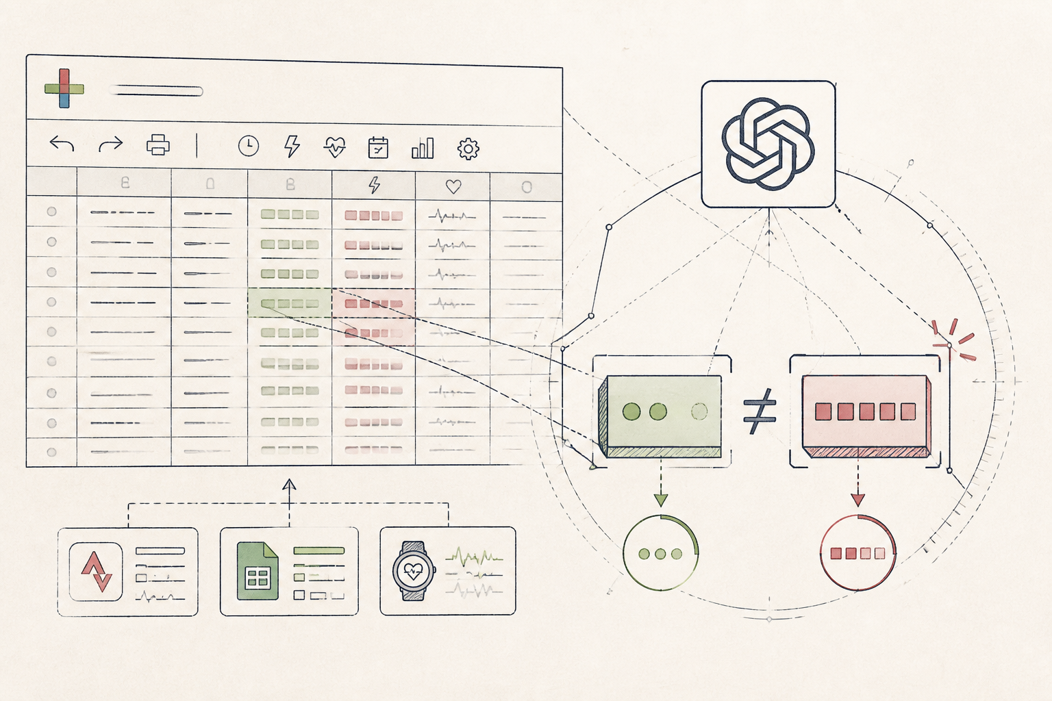
What the AI found
“Your Tuesday morning rides, despite being marked "easy," consistently averaged 15% higher power output than your designated moderate effort zone, indicating an opportunity for more effective zone training.”
Before
Disparate ride data, no performance insights
After
Consolidated insights, guided training adjustments
The same system, three states — real screens, not a screenshot
| Date | Duration — Avg_Power — Ride_Tag |
| 2023-10-23 | 01:15:00 — 185W — Commute |
| 2023-10-24 | 01:00:00 — 220W — Easy Ride |
| 2023-10-26 | 01:30:00 — 250W — Club Ride |
Prompt
Here is my cycling data for the past week: [PASTE GOOGLE SHEET DATA HERE]. My perceived effort zones are: Easy (150-180W), Moderate (190-230W), Hard (240W+). Can you analyse it for any inconsistencies between my perceived effort tags and actual power output, specifically looking for rides tagged 'easy' or 'moderate' that exceeded their typical power zones by more than 10%?
Here is my cycling data for the past week: [PASTE GOOGLE SHEET DATA HERE]. My perceived effort zones are: Easy (150-180W), Moderate (190-230W), Hard (240W+). Can you analyse it for any inconsistencies between my perceived effort tags and actual power output, specifically looking for rides tagged 'easy' or 'moderate' that exceeded their typical power zones by more than 10%?
AI
I've reviewed your cycling data. On October 24th, your ride tagged as 'Easy Ride' had an average power output of 220W. This is 22% above your stated Easy zone maximum (180W) and falls within your Moderate zone. This suggests an inconsistency between your tagging and actual exertion for that particular session.11.5 hours
Avg. Weekly Training Load
85% (3 of 4)
Easy Ride Adherence
1 detected
Moderate Zone Anomaly
From Haphazard Cycling to Structured Progress
A casual cyclist transforms inconsistent ride logs into a clear, actionable training overview using a simple AI integration.
A 41-year-old amateur cyclist, Northern Europe
Tools used
The real tools used here — swap any for your own equivalent. Each links to how we’d set it up.
Starting state
Before anything was set up
Our cyclist, keen on maintaining fitness and enjoying the Northern European countryside, diligently tracked every bike ride. Data accumulated across Strava, Apple Health, and a basic spreadsheet. Yet, without a unified view or analytical tool, the information remained raw, offering little in the way of actionable insights. Manual review felt overwhelming, often skipped.
| Date | Duration — Avg_Power — Ride_Tag |
| 2023-10-23 | 01:15:00 — 185W — Commute |
| 2023-10-24 | 01:00:00 — 220W — Easy Ride |
| 2023-10-26 | 01:30:00 — 250W — Club Ride |
| 2023-10-28 | 00:45:00 — 170W — Recovery |
Working state
Membership, doing its job
To bring order to this data, a weekly ritual was established. On Sunday mornings, the cyclist would export the past week's ride data into a Google Sheet. Then, using a custom prompt, they engaged a large language model via the Wellness & AI membership to synthesize the information, looking for patterns that might influence their training more effectively.
Prompt
Here is my cycling data for the past week: [PASTE GOOGLE SHEET DATA HERE]. My perceived effort zones are: Easy (150-180W), Moderate (190-230W), Hard (240W+). Can you analyse it for any inconsistencies between my perceived effort tags and actual power output, specifically looking for rides tagged 'easy' or 'moderate' that exceeded their typical power zones by more than 10%?
Here is my cycling data for the past week: [PASTE GOOGLE SHEET DATA HERE]. My perceived effort zones are: Easy (150-180W), Moderate (190-230W), Hard (240W+). Can you analyse it for any inconsistencies between my perceived effort tags and actual power output, specifically looking for rides tagged 'easy' or 'moderate' that exceeded their typical power zones by more than 10%?
AI
I've reviewed your cycling data. On October 24th, your ride tagged as 'Easy Ride' had an average power output of 220W. This is 22% above your stated Easy zone maximum (180W) and falls within your Moderate zone. This suggests an inconsistency between your tagging and actual exertion for that particular session.Use case implemented
The finished system, running on its own
The result was a concise weekly summary of training load, consistency, and specific performance anomalies. This streamlined process replaced guesswork with data-driven observation, allowing for subtle adjustments to their training plan each week. The system now provides an objective lens on subjective effort, ensuring training intensity aligns with goals.
11.5 hours
Avg. Weekly Training Load
85% (3 of 4)
Easy Ride Adherence
1 detected
Moderate Zone Anomaly
What an outside observer would notice
Reduced by 60%
Time spent analysing data
Improved by 20%
Training zone adherence
Increased clarity
Subjective-objective alignment
The stack — build it yourself
Familiar, flexible, and easy to export data from various sources.
Provides nuanced pattern recognition and summarisation capabilities.
Industry-standard for GPS tracking and power meter integration.
These are the tools used in this story. Any can be swapped for an equivalent you already trust.
Go deeper
Do this yourself
See Membership
This story runs on Membership. The tools and prompts above are the real build — swap any tool for your own equivalent and follow the same steps.