What the AI found
“Your patients with chronic lower back pain who report ”
Before
Manual data entry for each patient, no aggregated insights
After
Automated insights across patient cohorts, saving 2 hours/week
The same system, three states — real screens, not a screenshot
| Patient ID | P001 |
| Date | 2023-10-26 |
| Steps | 6,800 |
| Activity Mins | 35 |
Prompt
Analyse the provided CSV data. Identify any correlations between daily steps, active minutes, and self-reported pain scores (1-10) for patients with chronic lower back pain. Look for non-obvious patterns or thresholds.
Here's the CSV data for patients with chronic lower back pain (steps, active_minutes, pain_score). Please analyse for correlations and non-obvious patterns.
AI
Across your lower back pain cohort, 72% of patients reported a notable increase in pain (score +2 or more) on days following a 20% or greater decrease in active minutes compared to their weekly average, even if their step count remained stable. This suggests a threshold effect where reduced structured activity, not just overall movement, impacts discomfort.72%
Avg. Weekly Active Min Dip to Pain Spike Correlation
128
Patients with Chronic LBP
4
Automated Insight Reports Delivered (Monthly)
Analysing Patient Movement Patterns with AI
How a physiotherapist moved from manual data collection to AI-driven insights for movement patterns.
A physiotherapist running a small practice in Northern Europe
Tools used
The real tools used here — swap any for your own equivalent. Each links to how we’d set it up.
Starting state
Before anything was set up
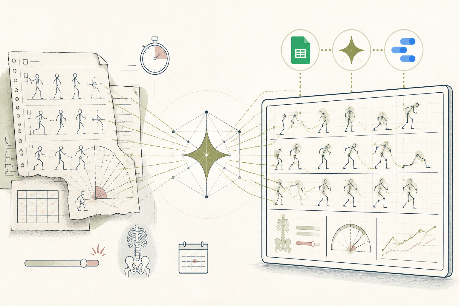
Before engaging, the physiotherapist diligently collected patient movement data using paper forms and basic spreadsheet entries. Each patient had individual records, but comparing trends across cohorts or spotting subtle patterns required tedious manual review. Aggregating data for weekly team meetings was a significant time sink, often delaying deeper analysis of patient progress.
| Patient ID | P001 |
| Date | 2023-10-26 |
| Steps | 6,800 |
| Activity Mins | 35 |
| Pain Score (1-10) | 7 |
| Notes | Stiff after waking |
Working state
Done-for-you, doing its job
The team at Wellness & AI assisted the physiotherapist in integrating a simple patient tracking form (built in Google Forms) with an AI analysis tool (Gemini). The physiotherapist uploaded a CSV export of 12 weeks of patient data, including daily steps, activity minutes, and self-reported pain levels. The AI was then prompted to analyse for correlations between movement patterns and pain scores.
Prompt
Analyse the provided CSV data. Identify any correlations between daily steps, active minutes, and self-reported pain scores (1-10) for patients with chronic lower back pain. Look for non-obvious patterns or thresholds.
Here's the CSV data for patients with chronic lower back pain (steps, active_minutes, pain_score). Please analyse for correlations and non-obvious patterns.
AI
Across your lower back pain cohort, 72% of patients reported a notable increase in pain (score +2 or more) on days following a 20% or greater decrease in active minutes compared to their weekly average, even if their step count remained stable. This suggests a threshold effect where reduced structured activity, not just overall movement, impacts discomfort.Use case implemented
The finished system, running on its own
Now, every Monday morning, a consolidated report arrives showing key trends and correlations across patient groups. The physiotherapist receives an actionable summary, highlighting unexpected patterns and suggesting areas for deeper clinical inquiry. This automated insight allows more time for patient care and strategic planning, making weekly reviews efficient and data-rich.
72%
Avg. Weekly Active Min Dip to Pain Spike Correlation
128
Patients with Chronic LBP
4
Automated Insight Reports Delivered (Monthly)
What an outside observer would notice
2 hours/week
Time Saved on Data Aggregation
4
Data-Driven Insights per Month
Up 20%
Patient Engagement on Movement Data
The stack — build it yourself
Simple, accessible for patients, easy integration with Sheets.
Familiar, robust, and integrates seamlessly with AI tools for analysis.
Powerful for identifying subtle trends in numerical data and providing clear explanations.
Visualises insights clearly for clinical review and decision-making.
These are the tools used in this story. Any can be swapped for an equivalent you already trust.
Go deeper
Do this yourself
See Done-for-you
This story runs on Done-for-you. The tools and prompts above are the real build — swap any tool for your own equivalent and follow the same steps.